
No items found.
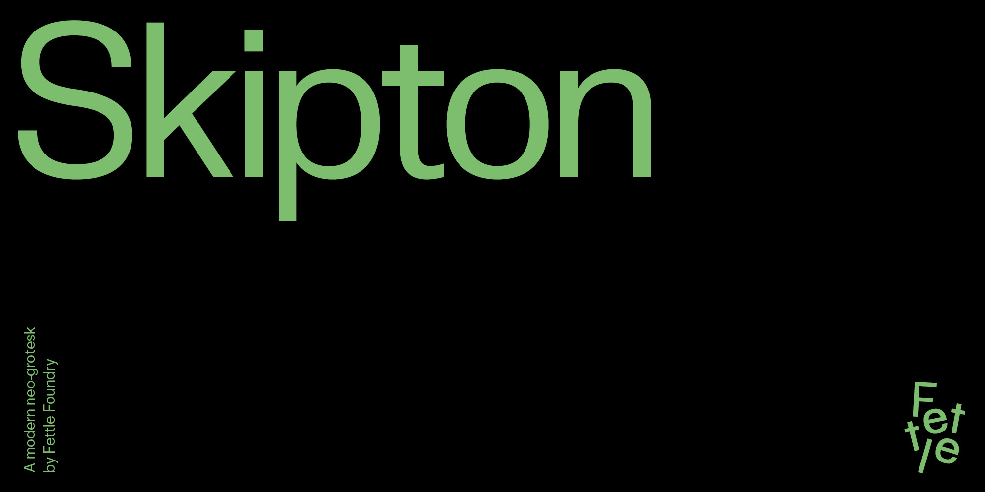
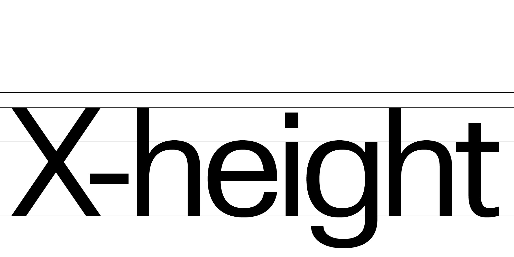
Skipton draws inspiration from modernist classics while introducing a smaller X-height, greater contrast, wider glyphs, flatter bowls, more open counters, and subtle flares.
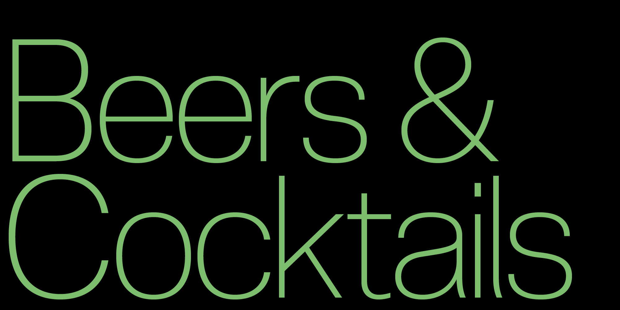
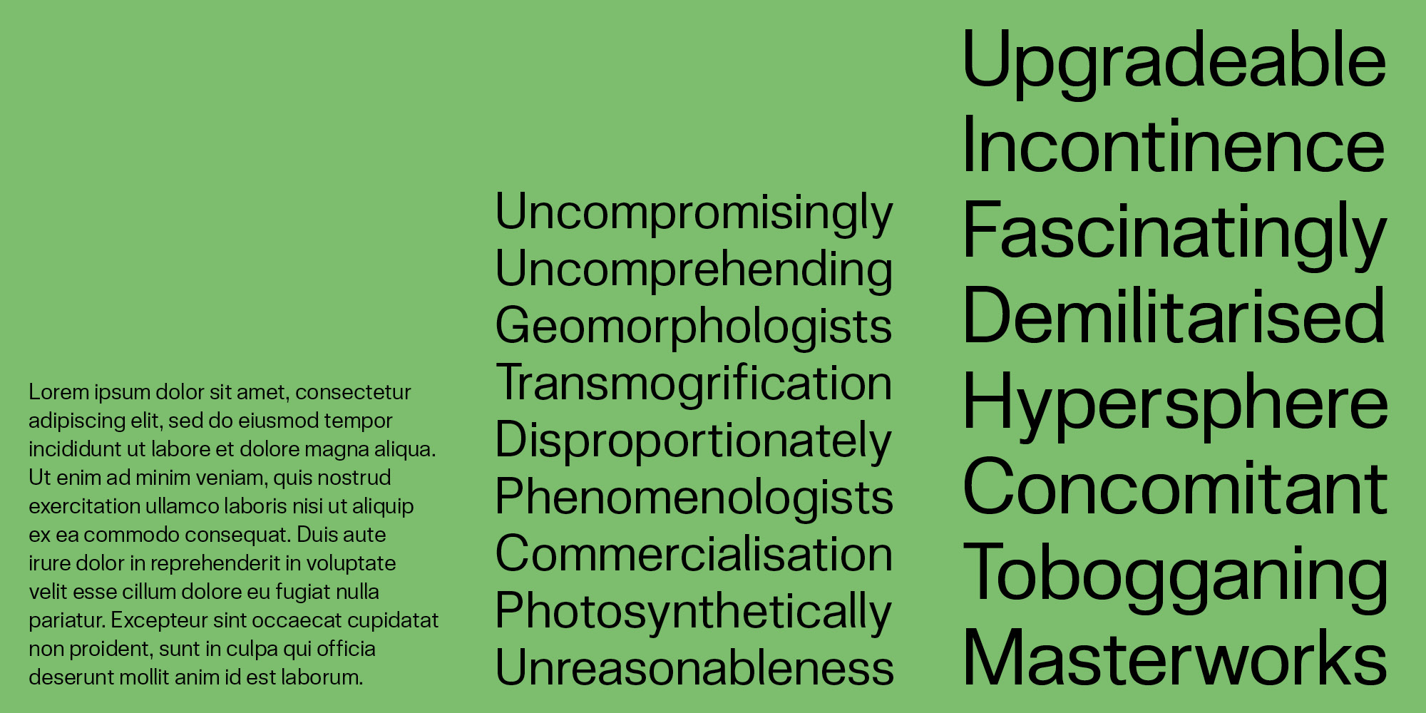
Designed for flexibility and legibility, Skipton is an excellent choice for designers and organisations creating branding, posters, websites, and other design applications that prioritise clarity, readability, and minimalism.
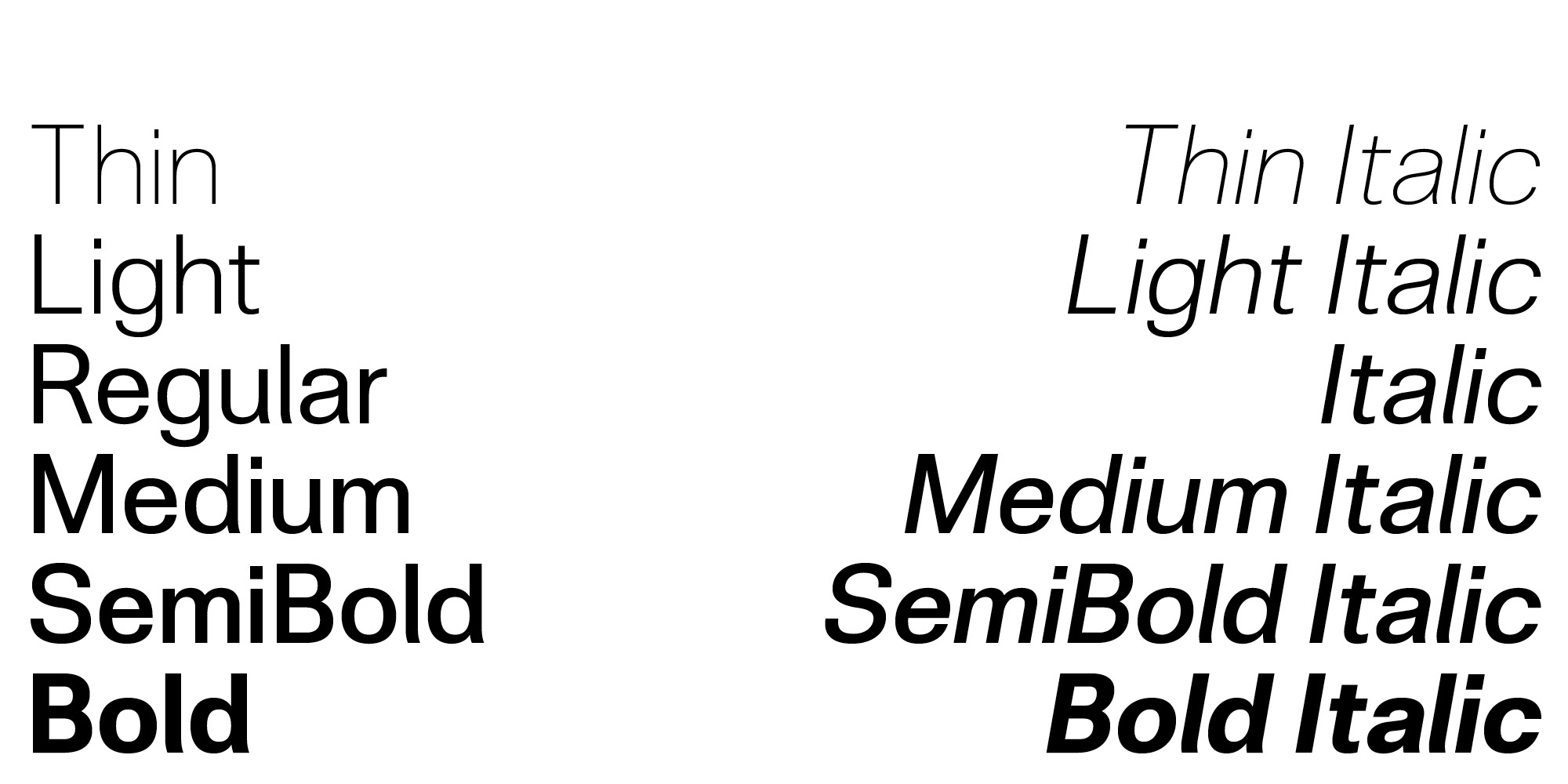
The italics adapt the oblique versions of the uprights, a traditional practice in this style. However, curve compensation and optical corrections have been applied to minimise the effects of sloping, creating a hybrid between obliques and true italics.
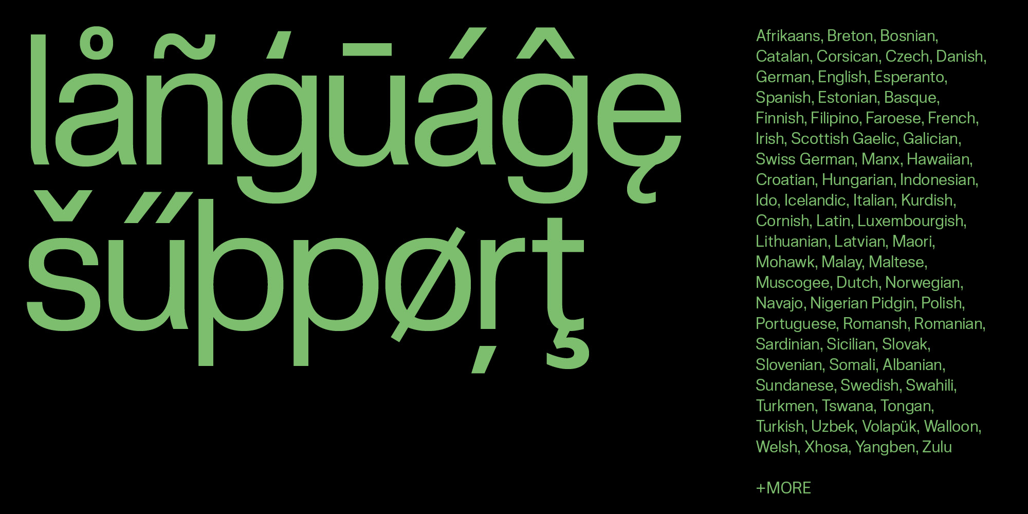
Inspired by European designs, Skipton includes an expansive Latin S character set supporting over 380 Latin-based languages. Thorough kerning has also been undertaken, especially between Latin-based, non-Anglophone character combinations, with special ligatures providing accurate multi-lingual typesetting options.
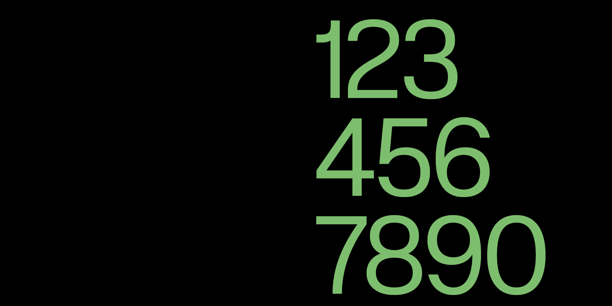
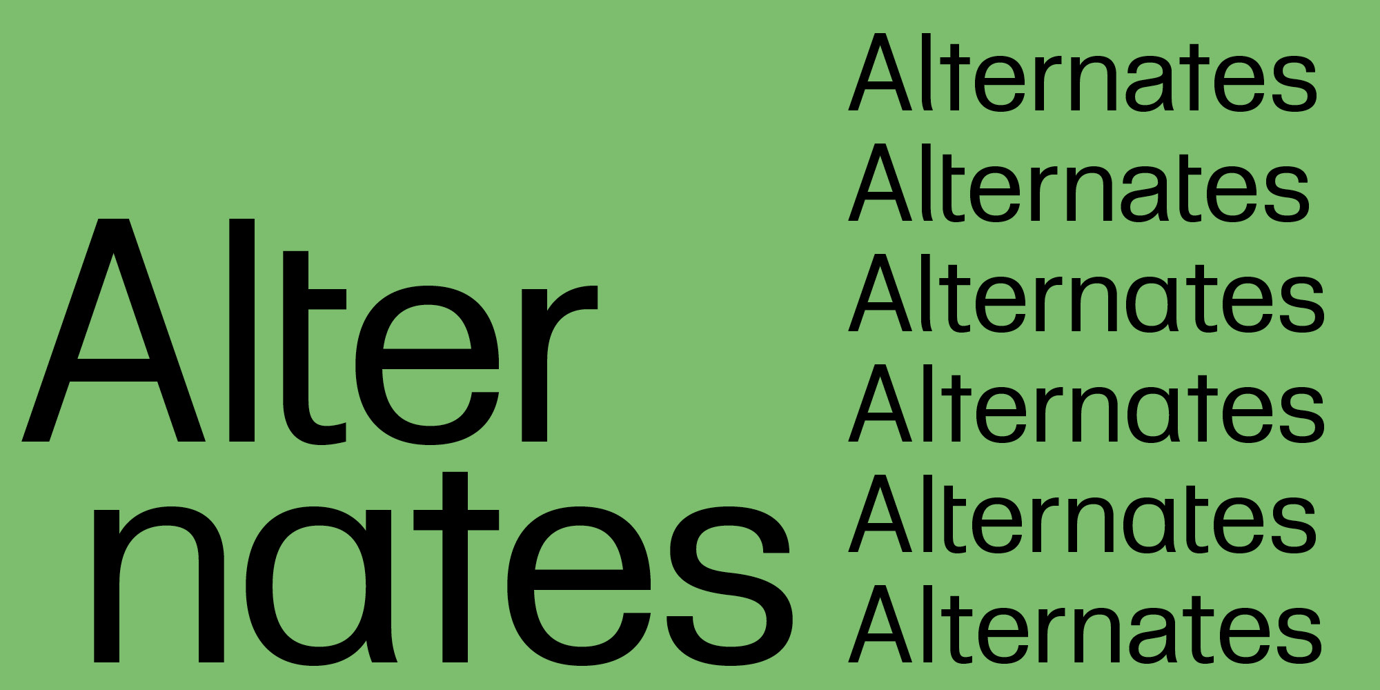
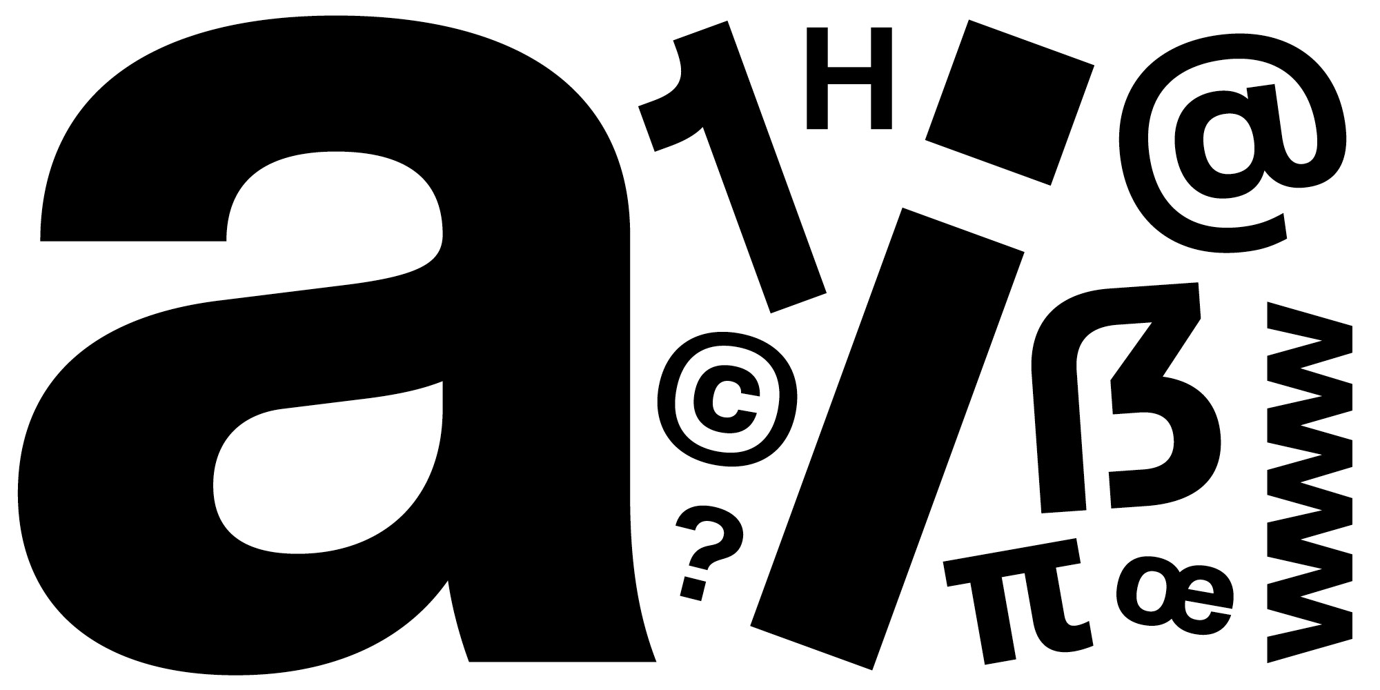
Skipton boasts an impressive 685 glyphs, including tabular figures, localised alternates, ligatures, mathematical symbols, fractions, superiors, inferiors, punctuation, extended currency symbols, arrows, shapes, and various additional elements.
Available in twelve weights (six Roman and six italic), Skipton offers the flexibility of a true workhorse without the inclusion of redundant or superfluous weights.